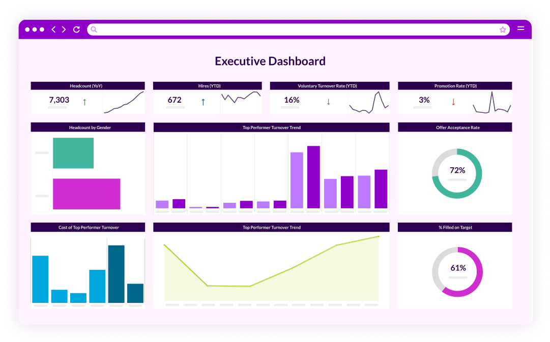
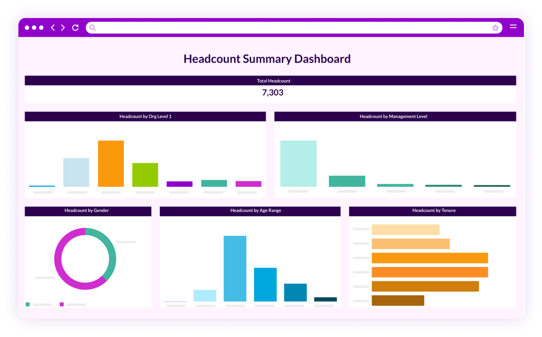
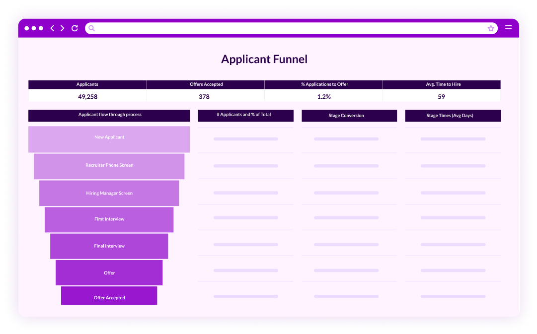
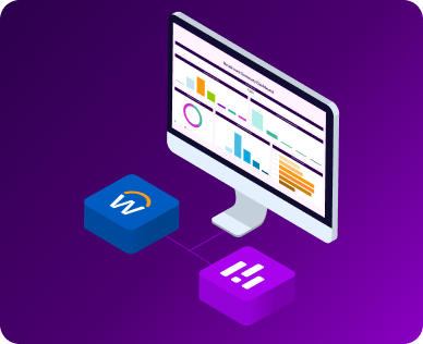
Before we get into the how-to portion, let us address the “why.” As companies scale from 500 to 10,000 employees, complexity skyrockets. You might see higher turnover in one region, a need for more robust DEI strategies in another, and a disconnect between recruiting and retention goals. Data storytelling helps to bring these challenges to life for leadership in a way that pie charts alone cannot. Numbers become catalysts for measurable action instead of just background noise. With PeopleInsight or another people analytics platform, you can unify disparate HR data sources (think ATS, HRIS, and engagement surveys), and transform them into an integrated picture of workforce trends. That is the heart of data storytelling: you shift from “we think we have a turnover problem” to “data shows our turnover rate increased by 15 percent in the West Coast region since last quarter, and here is the likely reason why.”
Yet great storytelling in HR is much more than stating trends or showcasing charts. It is about weaving context, emotion, and insight around your data so your audience (be it an HR team, an executive board, or managers in the field) feels compelled to act. You do not need to juggle data points while riding a unicycle. Instead, you need a logical structure that turns facts and figures into a cohesive narrative. This structure typically follows a three-part formula: begin with a challenge or question, proceed with data-based evidence, and finish with recommendations or solutions.
So, how do you develop this narrative? The first step is to ensure you have clean, consolidated data. This might be the least thrilling part of the process, but accurate data forms the cornerstone of every engaging story. Many HR teams at mid-market companies struggle with messy data scattered across multiple platforms. By implementing a people analytics solution like PeopleInsight, you can reduce the time spent cobbling together spreadsheets and focus on deeper analysis. Once your data is accurate, you can unearth patterns. Maybe turnover spikes follow a pattern of lackluster onboarding or insufficient career development opportunities. Perhaps the issue is more localized in specific departments or job roles. Data storytelling means taking these patterns, identifying possible causes, and framing it all with real-world examples.
The second essential component is choosing the right visualizations. A bar chart is not always the best option. Sometimes a line graph or scatter plot might be more appropriate, especially if you need to show correlations or trends over time. When it comes to workforce data, pie charts can quickly become cluttered, so you might want to use them sparingly. Above all, visuals should be clear, purposeful, and labeled with context. If you are presenting turnover rates, annotate the chart with a quick note about major organizational events that may have influenced these rates. For instance, if your company launched a new career development program, show how that ties into a reduction of turnover. By connecting the data visualization to real events, people begin to see how these numbers affect day-to-day activities.
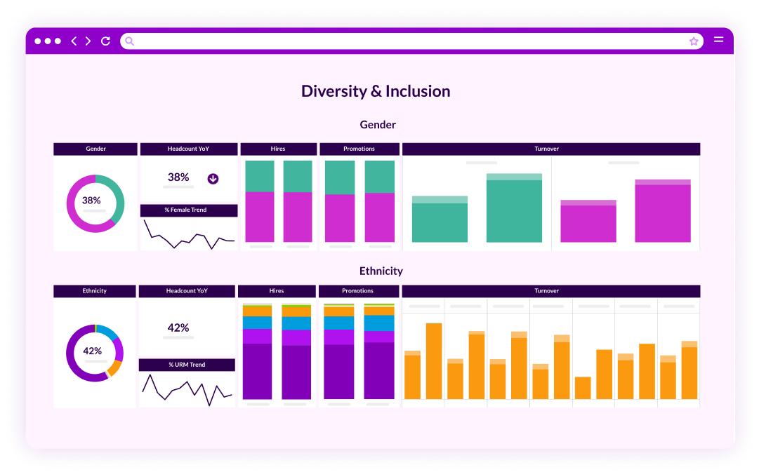
In many organizations, DEI strategies sit high on the priority list. Yet too often, these initiatives never progress beyond bullet points on a slide. Data-driven DEI strategies require metrics to gauge diversity, equity, inclusion, and belonging, along with targeted actions that encourage real organizational shifts. If the data tells you that female leaders are underrepresented, do not just stop at that observation. Show how it impacts recruitment, retention, and overall performance. You might, for example, visualize how the rate of new female hires has improved in the last three quarters, but the percentage of women promoted to leadership roles has stayed flat. That contradiction can spark questions about the barriers to advancement. Perhaps middle management is not receiving enough training in inclusive leadership. Integrating a solution like PeopleInsight allows you to track these changes more seamlessly, giving you the ability to refine DEI strategies with ongoing data analysis.
When presenting your data-driven stories to leadership, remember to maintain a human element. Numbers are important, but your colleagues and executive teams will connect more deeply if they understand the human implications. For instance, link a drop in turnover to employee feedback about flexible work policies. Show how a low promotion rate for diverse talent has stalled innovation in certain departments. The visual might be a bar chart that shows how many ideas get submitted by employees of varying backgrounds and how many actually move forward to implementation. Tying these numbers to real-life outcomes will help people see your story as more than just another spreadsheet.
Let us not forget: building your own storytelling skills takes practice. There are online workshops and certifications focused on data visualization, presentation, and general analytics. With PeopleInsight, we provide dedicated support from analysts who can guide data visualization best practices. The learning process can be enjoyable, so do not be afraid to have a little fun while you are at it. The more you immerse yourself in the art of presentation, learning where to place labels on a chart, how to highlight a key metric, and which narrative structure resonates most with your team, the more confident you will become.
