Stone-Cold Numbers: The Art of Data Storytelling

Stone-Cold Numbers: The Art of Data Storytelling

The spreadsheet is flawless, columns aligned, formulas audited, no rogue decimals in sight, yet the executive table stays unmoved. Why? Because numbers themselves never leap off the page to change a mind; humans do that with narratives. In the era of HR analytics and always-on data analytics dashboards, the competitive edge no longer hinges on who owns the richest dataset but on who translates that dataset into stories that spark decisions. For HR leaders, storytelling skills transform routine reports into strategic levers, turning head-count charts and turnover ratios into clear actions that raise productivity, strengthen culture, and protect the bottom line. Mastering this craft demands fluency in three languages: the vocabulary of statistics, the cadence of narrative, and the nuance of organizational context.

storytelling Blog illustration1

Why HR Needs Narrative as Much as Numbers

People operations live and die on credibility. Managers listen to guidance rooted in concrete evidence, yet even airtight metrics fall flat when separated from the realities teams face on the ground. A spike in resignations might read like a mathematical blip unless someone connects it to exit-interview quotes about stalled career growth. Data storytelling supplies that connective tissue, weaving together HR data insights with the lived experience of employees so leaders can grasp both scale and significance. In practice, a compelling story shortens the path from discovery to decision, compressing weeks of sluggish follow-up meetings into a single “Aha!” moment that nudges policy, budget, or behavior in the right direction.

Technology amplifies this potential. Modern people analytics platforms ship with self-service dashboards and augmented analytics engines that highlight anomalies and recommend next steps. Yet the algorithms only set the stage; HR must still craft the narrative arc that answers the eternal executive questions: What happened? Why did it happen? What should we do now?

Element 1: Framing the Plot with Context

Every story starts with a setting, and in analytics that setting is context. If a quarter-over-quarter turnover rate climbs from 9 percent to 11 percent, the raw figure means little without baseline history or industry benchmarks. Framing could sound like this: “Our attrition has trended below the SaaS-sector average for eight straight quarters, but Q2 broke that streak—particularly among mid-career engineers in R&D.” Now stakeholders understand deviation, magnitude, and the slice of workforce most affected.

Context also involves clarifying why the audience should care. Instead of launching into regression coefficients, open with the downstream impact: “At current recruiting costs, losing those engineers could shave three weeks off our next product release and add $1.2 million in replacement expenses.” Bridge statistics to strategy, and suddenly the room leans in.
Element 2: Humanizing the Metrics

Data can feel sterile until you reveal the faces behind the figures. In HR, those faces are employees, candidates, or managers who either thrive or stumble based on the policies under review. Character-driven storytelling does not mean revealing personal details; it means selecting anecdotes that embody trends. Maybe your exit analysis surfaces a theme: highly rated engineers depart when they plateau at senior-level for more than two review cycles. Introduce “Priya,” a composite persona of these leavers. “Priya hit every performance target for six years but saw no clear path to principal engineer. Two recruiters later, she walked.” The persona crystallizes an otherwise abstract retention challenge and inspires empathy without betraying confidentiality.

Element 3: Insight Begets Action

Compelling plots revolve around tension. In analytics, tension appears as gaps between current and desired outcomes: revenue shortfalls, engagement dips, diversity targets missed. Your data delivers the conflict; your recommendations deliver the resolution. Suppose sentiment surveys reveal women rate psychological safety seven points lower than men. That is conflict. The story resolves when you demonstrate, with evidence, which intervention narrows that gap. Maybe sponsorship programs boost safety scores by three points within two quarters. Closing this loop is what turns data-driven team management from slogan into operating principle.

Step 5: Conduct a Gap Assessment and Patch with Precision

A readiness assessment is the dress rehearsal no HR leader should skip. It exposes vulnerabilities—from unencrypted backups to stale vendor contracts—when there’s still time to fix them quietly. Once the report lands, prioritize remediation by risk and effort. Encrypting those weekly CSV exports to a benefits broker may take an afternoon, whereas replacing a legacy document-management server could span a quarter. Keep executives abreast of each fix’s impact in plain business terms: “Migrating to SSO will reduce password-reset tickets by 30 percent and mitigate credential-stuffing risk.” Linking remediation to measurable outcomes secures the budget and reinforces HR’s image as a strategic partner working from solid HR data insights.

Painting the Picture: Choosing the Right Visuals

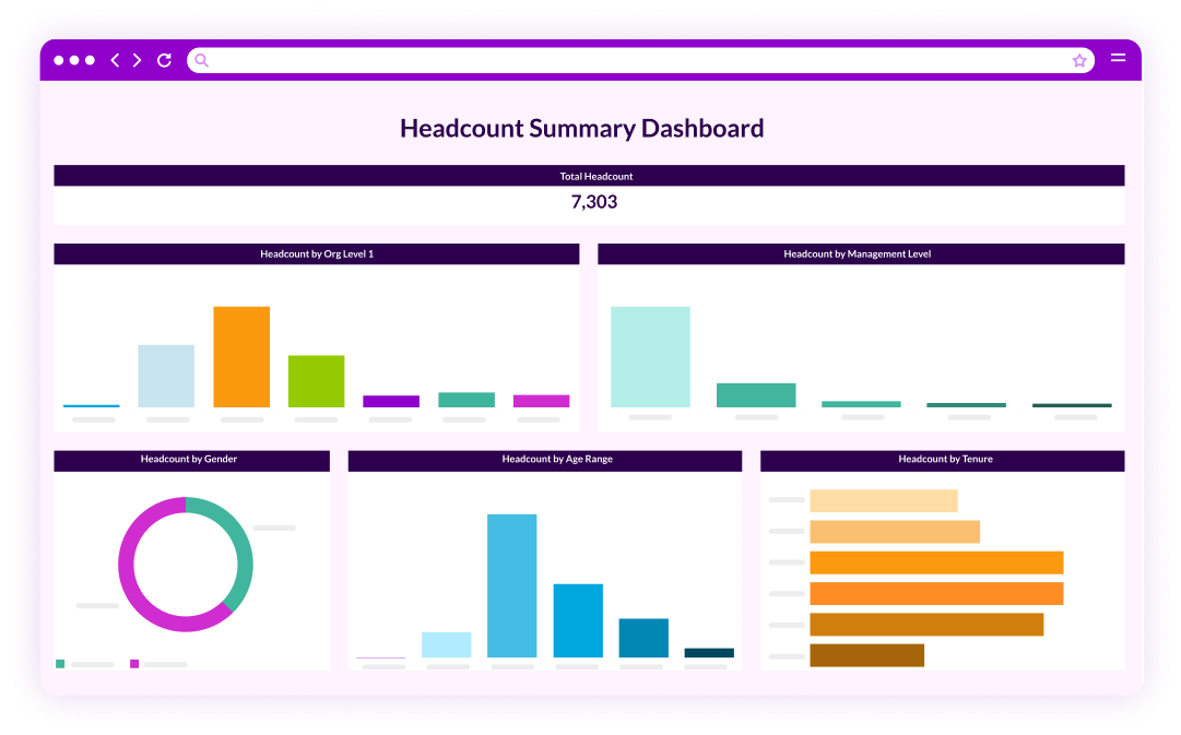
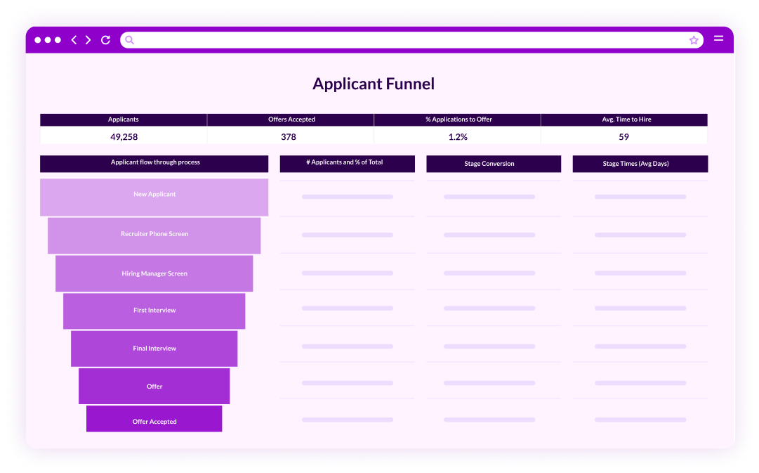
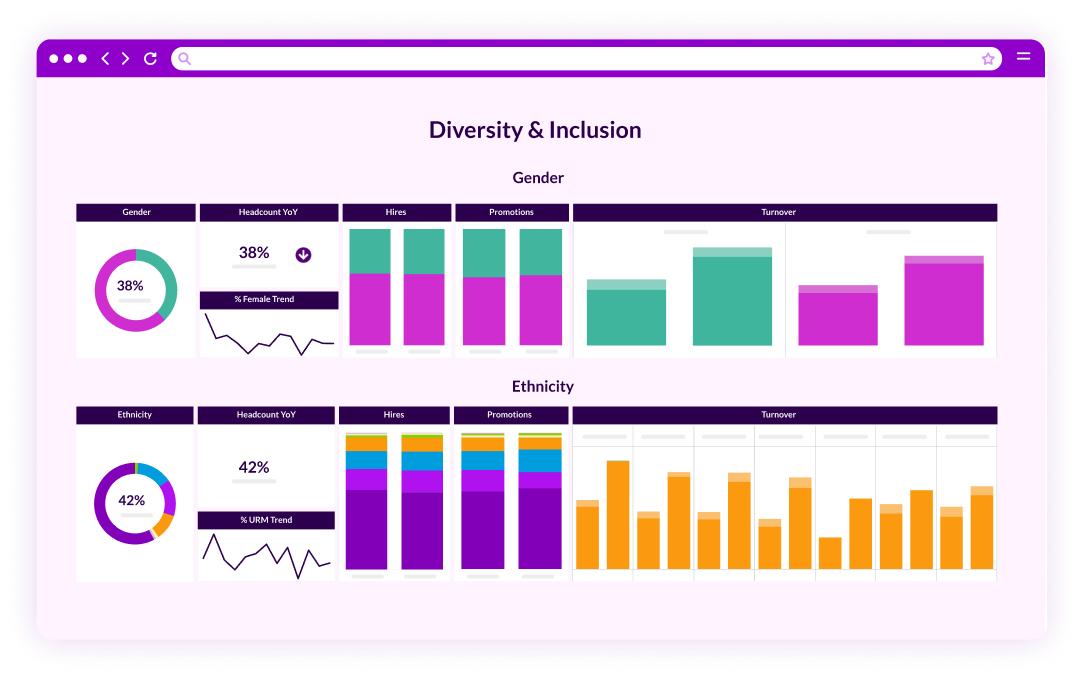
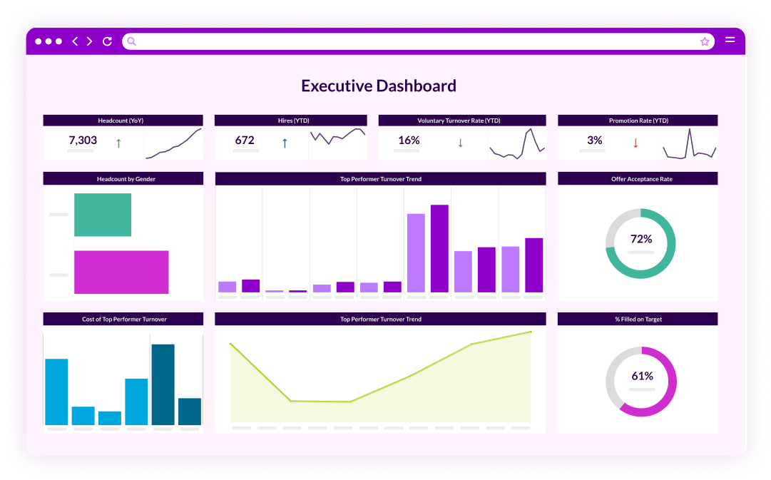
A scatter plot laden with p-values will thrill statisticians but may mystify senior executives. Visuals must clarify, not complicate. Heat maps effortlessly spotlight geographic or departmental hotspots, stacked-area charts display pipeline composition over time, and annotated line graphs juxtapose policy changes with outcome shifts. HR analytics solutions increasingly supply built-in templates optimized for board consumption, but the storyteller must decide which canvas best advances the narrative moment.

Augmented engines can help by recommending visuals based on data type; still, trust your audience intuition. If the CHRO winces at complex color gradients, pivot to simpler bar charts with succinct callouts. The artistry lies not in dazzling graphics but in making insight self-evident.

storytelling Blog HR illustration

Data Interpretation: Avoiding the Plot Holes

Misreading data undermines trust faster than any polished story can recover it, so careful data interpretation is non-negotiable. Correlation masquerading as causation remains the classic pitfall: a rise in remote-worker engagement following a stipend bump might tempt you to declare victory, yet without a control group or longitudinal trend, you cannot rule out novelty effects. Similarly, small sample sizes inflate variance; celebrate a five-point engagement surge among non-binary employees only if the base size supports statistical confidence.

Bias lurks not only in collection but in omission. If your workforce-planning dashboard excludes gig-worker attrition, a rosy retention outlook may hide looming contractor shortages. Include caveats and confidence intervals where relevant; honesty about limitations enhances credibility rather than diminishing it.

Cultivating a Data-Fluent Culture

Even the most elegant narrative fades if leaders cannot engage in dialogue about numbers. Building data fluency across HR and line management multiplies storytelling impact. Start with micro-learning modules on reading confidence intervals, interpreting p-values, and distinguishing between leading and lagging indicators. Then embed “storytelling checkpoints” into regular operations: quarterly business reviews kick off with a five-minute data vignette from each department, linking their KPIs to enterprise goals. Repetition normalizes evidence-based dialogue and nudges intuition-driven managers toward analytic rigor.

To accelerate the shift, enlist the prowess of HR analytics solutions that push individualized insights, like predictive retention scores, directly to a manager’s dashboard. The easier it is to access contextualized data, the faster behavioral change takes root.

Measuring the Story’s Success

A narrative ultimately serves decision-quality, so gauge success by action, not applause. Did the turnover story trigger an upskilling fund or career-pathing framework? Did the pay-equity analysis prompt budget allocation? Track post-presentation metrics, funding approvals, policy amendments, implementation velocity, to validate storytelling ROI. Over time, you’ll compile a portfolio of narrative wins that fortify HR’s strategic seat at the table. Moreover, analytics on analytics—the meta-layer—refines your craft. Tools now log dashboard views, hover time, and filter usage. If executives linger on the representation tab but ignore pipeline visuals, double down on the former or iterate the latter. Storytelling, after all, is an agile discipline.

From Data to Drama: Bringing It All Together

At first glance, “stone-cold numbers” and “art” appear contradictory. Yet sustained competitive advantage springs from the union of rigorous analysis and compelling narrative. Numbers authenticate the story; the story animates the numbers. Employ context to frame significance, characters to humanize stakes, and conflict-resolution arcs to align analytics with strategic intent. Choose visuals that simplify, interpret data with humility, and nurture a culture fluent in both metrics and meaning. Execute these practices consistently and you convert HR data insights into a shared language that rallies departments, guides investments, and shapes culture.

The great news? You do not have to piece together disparate spreadsheets, BI tools, and slide decks to build that language. PeopleInsight by HireRoad’s integrated analytics suite unifies workforce data, layers augmented analytics for instant anomaly detection, and surfaces ready-made narrative templates so HR can move from raw numbers to board-ready stories in minutes. If you’re ready to elevate HR from report factory to strategic storyteller, book a free demo with PeopleInsight by HireRoad today and let us help you transform stone-cold numbers into unstoppable momentum.