Translating Numbers Into Actionable Insights With HR Metrics and Dashboards

Translating Numbers Into Actionable Insights With HR Metrics and Dashboards

By Matt O’Connor

As a new leader at HireRoad I recently had the pleasure of moderating an engaging panel at an industry event focused on the forward-thinking approaches that organizations are using to harness actionable insights through HR metrics and data visualization.

Our panel consisted of Ken Clar, director of workforce intelligence at Ansys; Roxanne Laczo, head of people analytics at Cloudflare; and Ian McLendon, senior director of workforce analytics at Norfolk Southern Railway. With varying but equally impressive experiences in people analytics at their respective companies, this panel delved into the best practices for designing and utilizing HR dashboards. What a fun and smart group! Here’s a recap of our discussion and key takeaways.

Selecting Relevant Metrics Aligned With Organizational Goals

One of the foundational elements we explored was the election of relevant metrics that align with your organizational goals. It’s essential to identify what truly matters to your business objectives so you can manipulate those levers to achieve better outcomes. 

Choosing the right information to focus on will help you achieve a strong return on investment and affect meaningful change. For instance, let’s say that reducing employee turnover is one of your top priorities. Metrics related to retention rates, employee satisfaction, and engagement should be front and center. 

Our panel also discussed the value of aligning HR metrics with broader business goals. Ken Clar emphasized that “many organizations are data rich but information poor.” 

The analytics process should focus on giving business leaders relevant insights, not simply bombarding them with data points. Clar put it best, saying, “If we start with metrics from the HR side of things, we run the risk of disenfranchising our business leaders. Instead, start with the business priorities and metrics, and go from there.” 

He went on to say, “People get intimidated by the math in people analytics. The extent to which we can break that down and democratize the data, the more we can expand our impact and make our stakeholders successful.” 

Get members from every level of the organization involved in the metrics selection process. Identify big-picture business goals and then select several data points that can help you measure your progress toward those objectives.
Importance of Data Quality, Reliability, and Consistency

Data quality was another recurring theme during our panel discussion. Ian McLendon spoke about his organization’s commitment to equipping clients with actionable insights. He said, “Our priority is to make sure our HR leaders have consistent and reliable data at their fingertips so that they can better serve the businesses that they support.” 

The panel agreed that standardizing data collection methods across the organization helps in maintaining consistency. This involves using uniform definitions and calculations for metrics, ensuring that everyone is on the same page. 

Roxanne Laczo noted that her organization has made the “transition from operational dashboard usage to proactive reminders to go out and find answers in the dashboards we’ve created.” These steps have promoted the consistent use of data insights throughout the company, thereby leading to informed decision-making. 

All panelists agreed that increasing data quality and consistency gave their teams the confidence to embrace information-driven decision-making processes. They set the stage for a cultural shift by empowering their staff with accurate and timely information.

Challenges, Successes, and Innovation

All of our panelists noticed a recurring myth in the people analytics space that fancier data and more sophisticated presentations automatically equate to “better” insights. 

Laczo addressed the misconception head-on, stating, “Sophisticated doesn’t equal fancy. A basic bar chart will tell more to a senior executive than some predictive model. The simplest data views can tell the biggest story in a powerful way.” 

Clar built on Laczo’s points, stating, “Dashboards are the entry point. There’s a lot of content that, if poorly designed, can take away from the value of the data.” 

We all agreed that having a great dashboard provides users a seat at the analytics table, but it’s important that those interfaces maintain a user-friendly interface and feature easy-to-digest insights. 

Another common challenge that our panelists noted was resistance to change. Implementing new metrics and dashboards often requires a shift in mindset and processes, which can be met with friction from different levels of the organization. 

McLendon spoke about the importance of managing change and prioritizing user buy-in from day one. 

He said, “If you spend all your time running analysis but don’t have an output that can be delivered consistently to your business, that’s a detriment to your team. The end product is crucial for getting buy-in and trust and taking the investment in people analytics further.”

Utilizing Predictive Analytics in HR Dashboards

The use of predictive analytics in human resources interfaces was another hot topic. Predictive analytics enables organizations to forecast future trends and outcomes based on historical data, providing HR management with the ability to be more proactive. 

During the panel discussion, I asked the participants if a dashboard should encourage end users to dig deeper into the numbers or if the interface should point them exactly to where they should be looking. There were mixed sentiments about this idea.

McLendon said, “A dashboard should be focused. What question are you trying to answer with your dashboard — that answer should be above the fold; it shouldn’t require any digging.” However, he conceded that secondary and tertiary questions may require users to explore the data to find answers. 

Clar said, “It’s dangerous when a dashboard is showing people where to focus their attention. What we focus on is what’s aligned to the strategy of the business; from there, we can add additional layers for teams who want to go deeper.” 

McLendon believes the dashboard should draw attention to primary issues and present answers to important questions by making analytics data readily available. Clar views a dashboard as a point of access through which users can ask and answer any question they like, so long as their digging pertains to relevant business goals.

Visual Representation of Data for Maximum Impact

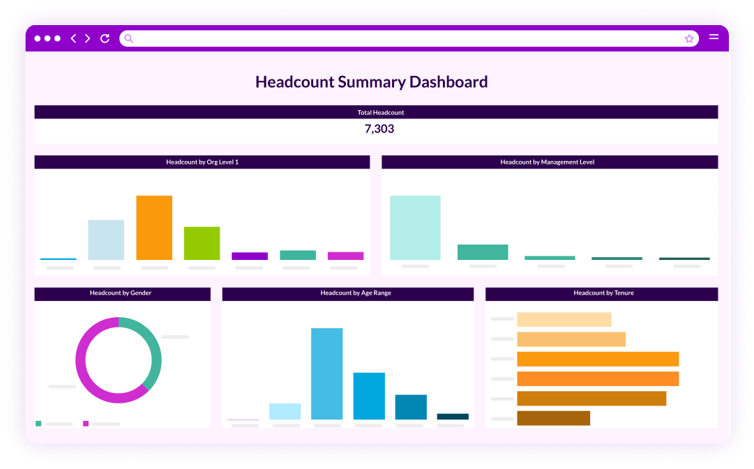
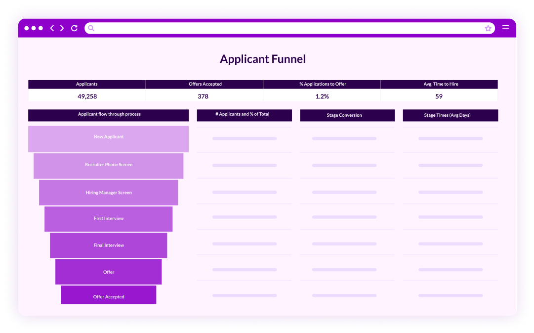
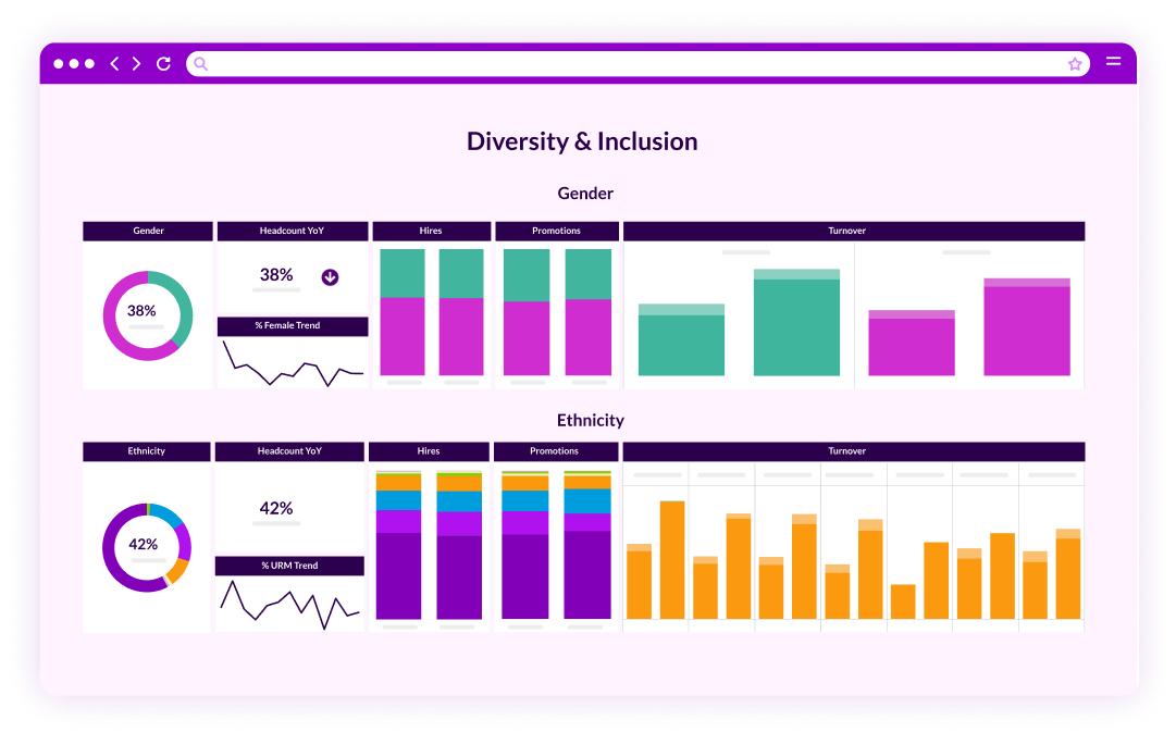
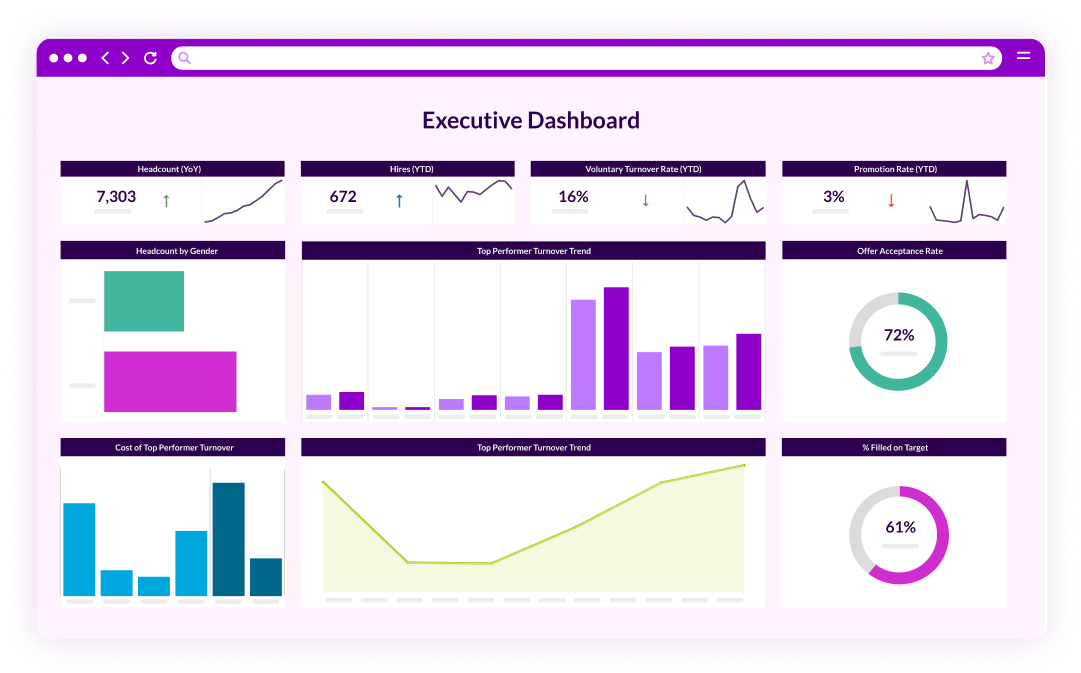
Toward the end of the discussion, we shifted our attention to the importance of using easy-to-digest visualizations. Well-designed dashboards and visualizations can make complex data more accessible and understandable for stakeholders. 

There aren’t any one-size-fits-all dashboards. Giving workers the ability to tailor their analytics experience will promote better buy-in and higher utilization rates. 

All panelists have embraced dashboards as user-friendly interfaces that make people analytics data usable at all levels of the organization. We agree that the most intuitive interfaces also offer a high degree of customization. 

HR leaders can shape their dashboards to prioritize data that is most relevant to them. Executives can do the same, as can mid-level management staff.

Why Businesses Must Prioritize Quality and Accessibility Over Sophistication

The common theme across our panel discussion is the importance of accessibility and quality. While having sophisticated analytics tools and robust visuals is great, it should never be the priority of a people analytics program. Starting with quality data and practical charts will encourage members of an organization to embrace change. 

All of our panelists have successfully implemented people analytics at their own companies by prioritizing goal alignment and positive user experiences. When those concepts dominate the analytics planning and implementation process, change resistance can be kept to a minimum.

Start Your Data Journey With PeopleInsight from HireRoad

Leveraging HR metrics and data visualization techniques can significantly enhance your company’s ability to make informed, data-driven decisions. Select relevant metrics, ensure your team is on board, and choose a dashboard that offers sufficient customization. 

If your organization is starved of people analytics data, it will be incredibly difficult to make informed decisions that optimize productivity and retention. The good news is that you can end the information famine with the help of innovative partners like HireRoad.

Schedule a demo with PeopleInsight by HireRoad to learn more about our people analytics capabilities.

People analytics vs transactional reporting ebook cover

Matt O’Connor

Chief Revenue Officer

Matt joins HireRoad as a well-respected HR tech industry veteran, with a strong track record of accomplishments at the executive leadership level.  He most recently served as Chief Revenue Officer for PandoLogic, and before that, he was Senior Vice President/General Manager of Revenue for Care.com. Matt spent seven years at Monster Worldwide, leading U.S. sales teams in driving revenue growth. Named one of TA Tech’s Most Influential Talent Acquisition Thought Leaders in 2023, Matt brings a wealth of industry experience and strategic acumen to HireRoad.