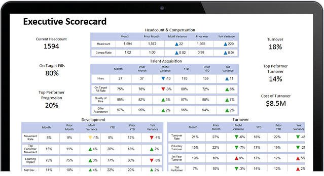
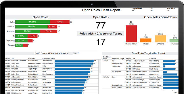
The human brain is wired to process information visually, making visualization one of the best ways to understand data, particularly when presenting to business leaders and other stakeholders in your company.
This isn’t an earth-shattering notion. We’ve internalized this… it’s part of our culture that a picture is worth a 1000 words, every picture tells a story, and seeing is believing. I could go on with examples here but I’m sure you get the picture. [see what I did there?  ] Culturally, we equate seeing/sight/vision with understanding, knowing and believing.
With so much HR and Talent data at our disposal, its critical that we come up with ways to distill the volume into manageable and meaningful chunks of information. A key way to do this is via data visualization. David McCandless in his famous TED talk “The Beauty of Data Visualization” drives this point home.
It seems common sense but why then do we still attend or present at meetings with slides consisting of rows and columns of numbers, or text-heavy slides with a crude chart or two as illustration of the points? Why do annual reports favour flat data, charts and lists, and heavy text explanations?
These aren’t useful for business leaders. This is information that’s hard to understand – and even harder to act on.
If you’re involved in gathering, synthesizing, analyzing, reporting on, or presenting HR and Talent data in any way, take a minute and take stock of how you are doing this:
- Are you confident in, and proud of, the ways the information is presented?
- Are you using the same reporting template over and over again? Is it past its prime?
- Is your data flat or dynamic? Dull or inspiring?
- Is your audience engaged or do they glaze over? Could they remember your key messages if asked 2 days later?
- Does your presentation inspire questions, dialogue and more requests for information?
If you aren’t thrilled with your answers to the above questions, and assuming you have access to the right data and analytics to communicate what the business needs to know, you should consider ramping up the visualization of your data as a first step at change. Yes, in this case, looks do matter!The good news is, for mid-sized companies it’s easier these days to find a solution that makes visualizations simple and that has best design practices built in. Leveraging a visualization solution enables you to focus on your data and its meaning. If you have all the data and analytics you need, if your people data is connected and driving to business outcomes, you can make use of desktop solutions such as Tableau, Visual.ly and Qlik, to bring your data to life visually. If, like many mid-sized organizations, you need help bringing your people data together and connecting it to business outcomes, HireRoad can help do this as well as present it in ways that impress in the boardroom and drive meaningful decisions. There are options outside what your spreadsheets can produce – you should explore them.
HR and Talent leaders today are expected to report on the people data and to report in a way that matters to the business – this may include foundational measures of headcount, turnover, employee engagement, open requisitions, time to fill, cost of hire, and may extend to answering key business questions such as cost of top performer turnover, alignment with diversity plan, quality of hire, and more.
When you start with flat, grey data or an over-emphasis on words you effectively shut down some key brain functions, kill creative thinking and supress emotional response in your audience. You’re all left brain and no right. Here, you can get lost in rationalizations, logic, calculations and not get to creativity, problem-solving, ideas and collaboration.
This certainly isn’t the outcome HR is looking to achieve. We should be telling a compelling story about the people and the data, and making connections to business outcomes. Unfortunately, for many of us, our current reporting style holds us back.
But a quick pivot to presenting your data in a more visually appealing manner, can help you in a number of ways:
- Because visual information is more attractive, it piques interest and attention even before information is actually processed. So… right off the bat, before you’ve even started you have the attention of your audience.
- Comprehension is much faster with visual images, our brains being hard-wired to seek out and interpret relationships and patterns. This can happen in seconds when we employ culturally relevant codes in terms of size, shape and colour.
- Retention is stronger. We are more likely to remember facts and information presented visually (rather than verbally or textually) for a longer period of time.
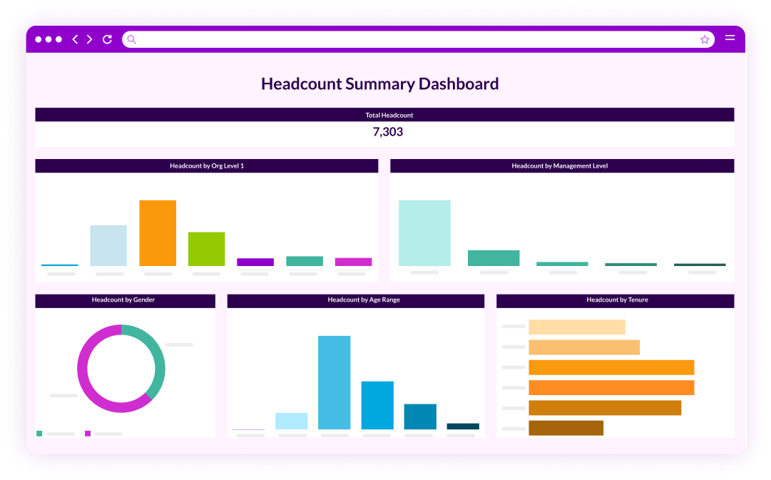
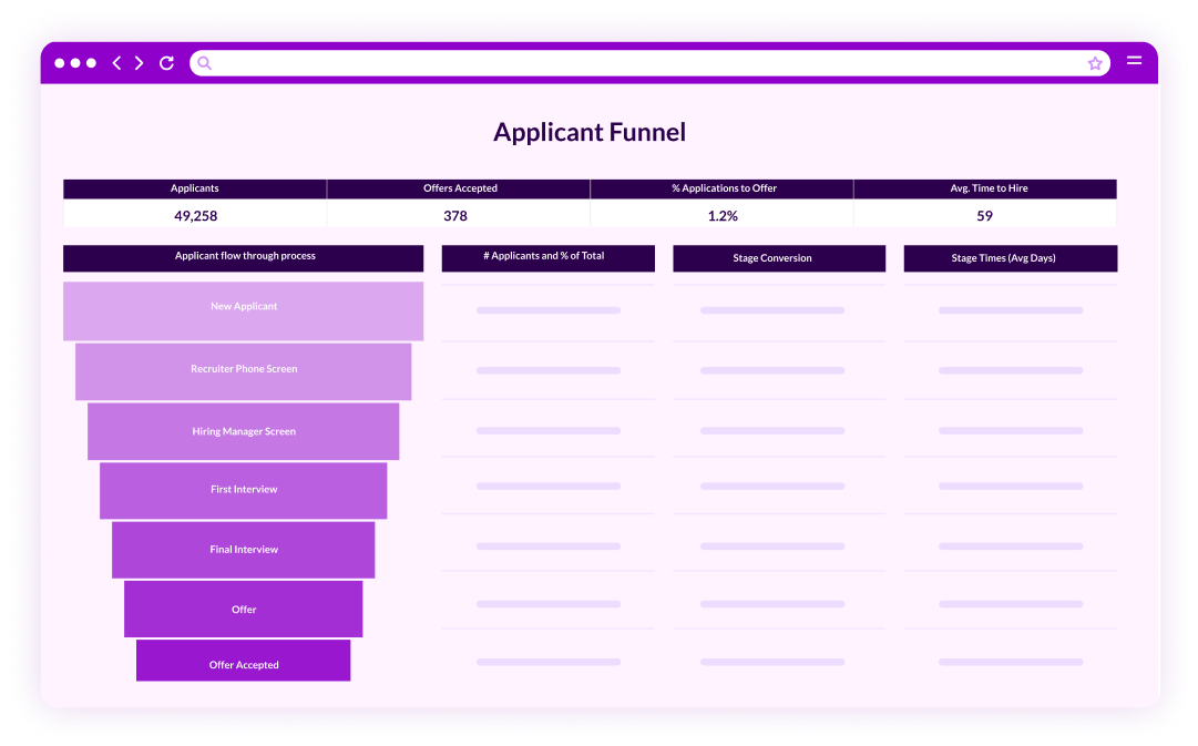
Here are two examples of data visualizations that have transformed dialogue and decision-making for our customers:
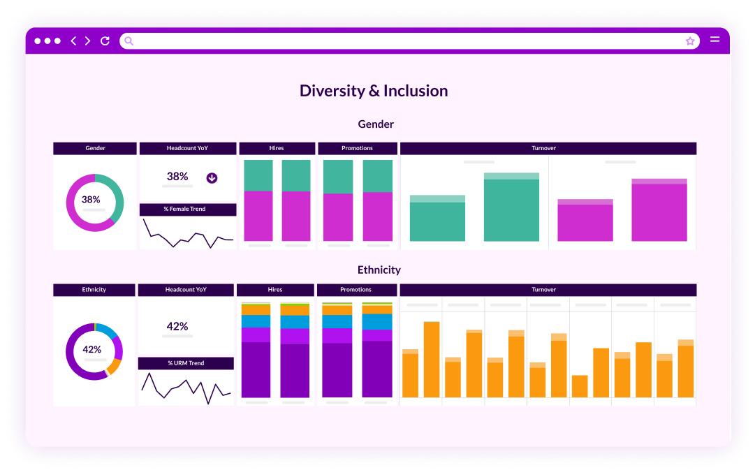
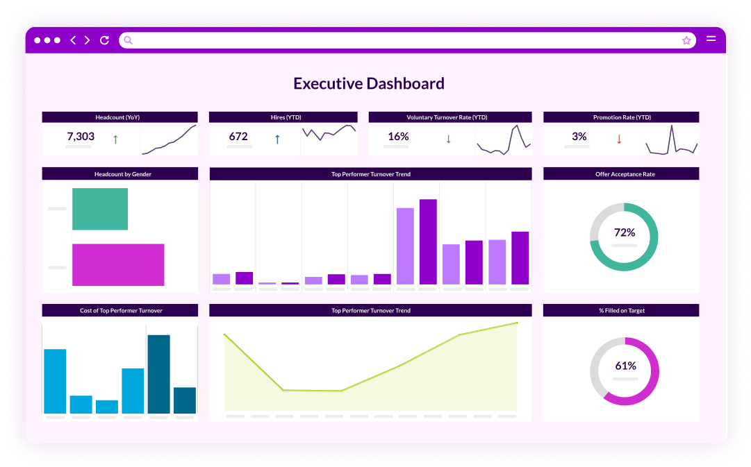










 ] Culturally, we equate seeing/sight/vision with understanding, knowing and believing.