Best Practices for Quarterly Reporting

Updated on June 25, 2020
 
We’ve talked about HR Reporting and offered some tips on how to make your reporting as effective as it can be. First we introduced 3 questions that should be asked of any reporting that is done with a regular cadence – monthly, quarterly, annually – where you can get into the habit of “same old, same old”. The questions we posed were designed to get you thinking about your reporting and whether it could be more effective.

Last week we offered up our top tips – 4 Do’s and 1 Don’t to help you flesh out your reporting to ensure it resonates with your audience.

This week we cap off the topic with an example of some of the scorecards and analytic views that might be included in a quarterly report.  We’ll enlist some mock scenarios and our demo data to take you through the visuals we’ve chosen to showcase.

Remember, the key to your quarterly report is preparation – getting started early and building the story you want to tell, including both your core metrics and analytics related to new strategic priorities and initiatives.

The Executive Scorecard

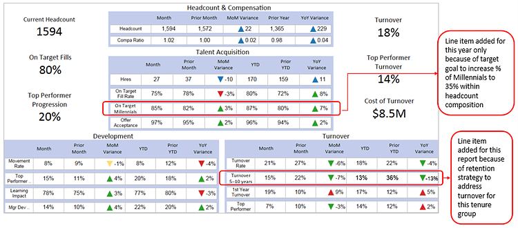
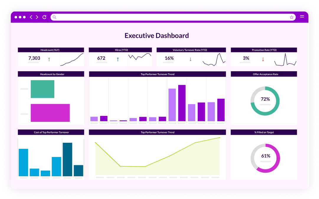
This scorecard provides an at-a-glance view of many of the important metrics being monitored over time.  For our particular example, the executive view includes high level information on turnover and headcount, as well as a look at talent acquisition activities and movements. These metrics are included with consistency across all reports, whether they are monthly, quarterly or annual given that they are priorities for the business.  

In addition to the regular metrics covered, for this particular quarterly report, there are important initiatives that need to be covered. In this case, there are two important areas where progress is being tracked and that merit being called out in the Exec Scorecard:

  • A hiring initiative to grow Millennials to 35% of headcount composition 

and

  • Efforts to reverse turnover for a tenure of 5-10 years.

You’ll see in our dashboard these two areas have been added as line items.  


What you include in each quarterly report will differ based on what’s going on in the business at that moment in time. Your scorecard needs to reflect the story you want to tell and the progress you’ve made on key initiatives – not just the same-old, same-old metrics month over month.
Headcount Summary

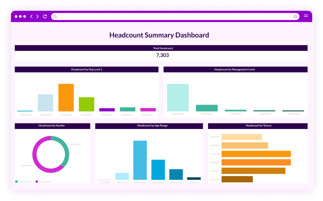
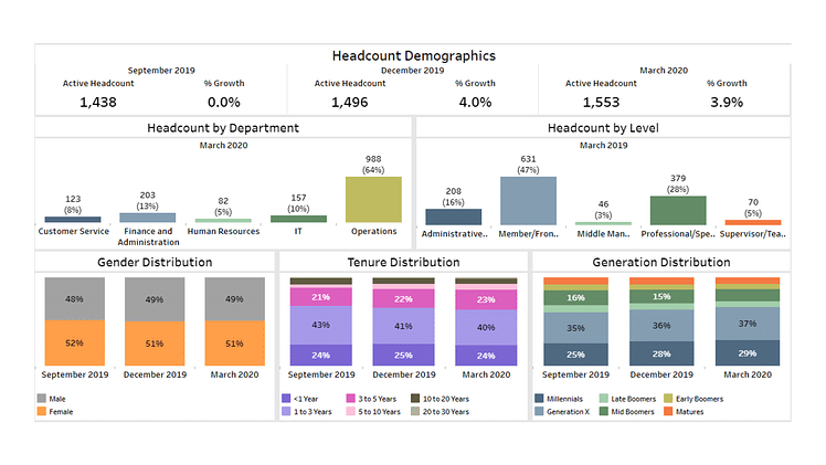
For the headcount summary we’ve included all the usual measures like headcount growth year over year and headcount by department, level, age, and tenure. For this particular quarterly report we’ve included a focus on generation, driven from our strategy to grow Millennials in the workforce to 35%. At the moment, Millennials are sitting at 33%, an increase from 28% so we are getting there. It’s important to call out this trend.

Turnover

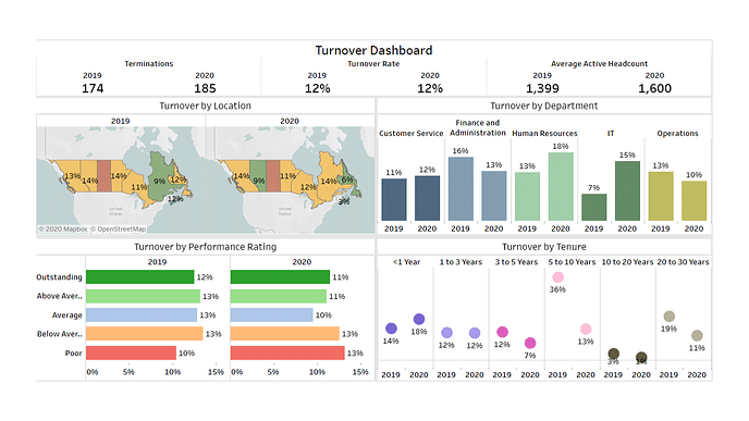
Similar to the headcount summary, we include all the regular metrics around turnover, those we monitor on an ongoing basis – turnover by department, HiPo turnover, and overall turnover rate by location. However, in this quarterly report we’ve added a look at turnover by tenure given that this is a current area of investment. This is based on our previous discovery that we were experiencing a high level of turnover at the 5 year tenure mark. As a result, a number of programs were put in place focused on retention around year 5. We implemented changes to benefits, recognition and more. In the quarterly report, it’s important to call out that to date, these efforts are working quite well – turnover has reduced from 36% to 13% among 5 to 10 years tenured employees.  This is an element to monitor over time.

Promotions

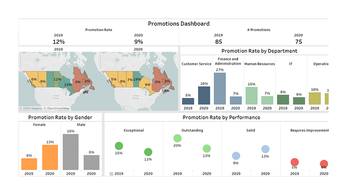
A Promotions Dashboard is included in this quarterly report as a topic for discussion. In this area we are drawing attention to the promotion rate by performance and, in particular, pointing out the slight decrease among our outstanding and exceptional performers.  

Recognition Participation


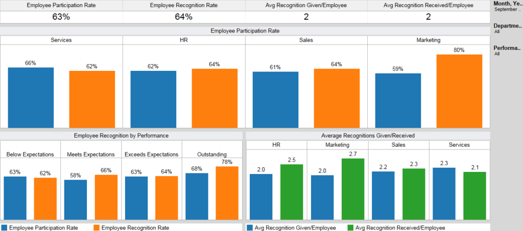
In this quarterly report we decided to include a Recognition Participation view. This is because a new Recognition program was introduced in this quarter as one of our many initiatives to address turnover. This is a storyline that highlights one way we are supporting the initiative to retain employees and energize the workforce. It’s an area we are interested in monitoring and once we reach our participation goal, this may drop off the quarterly report to make room for other key initiatives. Again, the quarterly report is a living document that evolves as your priorities do so this specific dashboard may only be presented a time or two.

Diversity and Inclusion

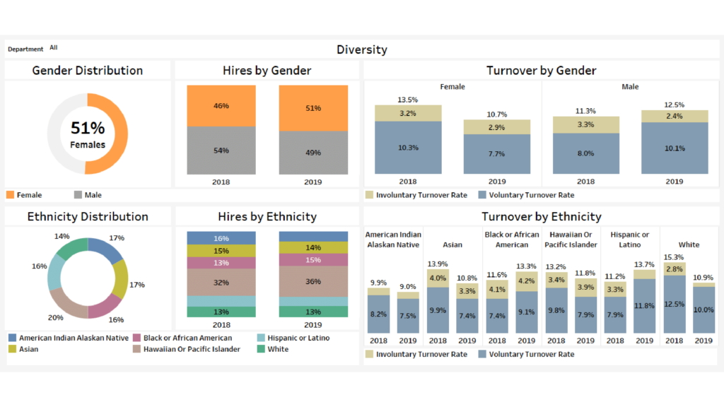
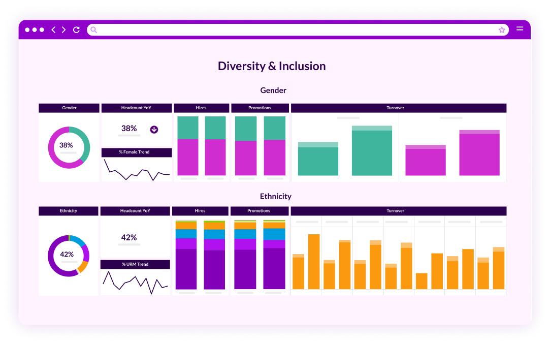
Lastly, in this quarterly report we included our Diversity and Inclusion dashboard. Diversity and inclusion are more than issues for compliance or business performance but they are essential to your corporate values and conscience. It is not just about attracting a diverse group of applicants and new hires but a focus on diversity and inclusion must span the entire employee life cycle and be part of the fabric of company and culture overall – including sourcing pools, hiring decisions, pay equity, promotions and most importantly, executive team makeup.

It is critical that the diversity and inclusion analytics covers;

  • A topline understanding of how the organization is performing with diversity and inclusion.
  • Going beyond these basics to segment and quantify the gaps you may have, gain a deeper understanding of the experiences and context for our diverse talent, and generating insight into the best way to build cultural belonging.

….

Although these are just a few examples of analytic views and dashboards that might be included in a quarterly report they help illustrate our best practices:

  • Focus on the story you want to tell – In this case the quarterly report focused on some key storylines – the initiatives around hiring Millennials, and Turnover among employees past the 5 year tenure mark. Analytics were grouped together to tell the story and show progress in these areas, including showcasing progress in supporting programs like recognition and promotions.
  • Evolving data and analytics – For this report, it was important to add in new analytics that aligned with the changing priorities and new investment areas. And because we started planning this report well in advance we knew we needed to start collecting data on the new programs we put in place to address turnover – recognition being the one we focused on in the report. This meant making choices in terms of data we wanted to include in this quarterly report and data it was okay to park for the time being.
  • Keep it clean – The dashboards were put together with an eye to removing unnecessary information, adding in key analytics related to the current initiatives. We resisted the temptation to include more analytics.  Each visual was built out with the goal of balancing the core set of metrics that are included on an ongoing basis, with the insertion of new views highlighting new strategic initiatives.
  • Tailor the report to the audience – The dashboards were constructed with the Exec audience in mind. To that end, only the necessary analytics were included and the story was kept high-level. We knew that if necessary, we had the ability to filter and drill down on the fly (to individual record level) if and when questions were raised or more detail required.